CometChatMessageHeader component displays user or group details in the toolbar including avatar, name, status, and typing indicators. It also provides navigation controls and call buttons.

AI Agent Component Spec
AI Agent Component Spec
Where It Fits
CometChatMessageHeader displays the recipient’s information at the top of the chat screen. It’s typically used within CometChatMessages alongside CometChatMessageList and CometChatMessageComposer.
Minimal Render
Actions and Events
Callback Props
onBack
Fires when the back button is pressed. Use this for custom navigation handling.onError
Fires when an error occurs.Actions Reference
| Method | Description | Example |
|---|---|---|
set(onBack:) | Triggered when back button is pressed | Custom navigation |
set(onError:) | Triggered when an error occurs | Show error alert |
set(user:) | Sets the user to display | Configure header for user |
set(group:) | Sets the group to display | Configure header for group |
SDK Events (Real-Time, Automatic)
| SDK Listener | Internal behavior |
|---|---|
onUserOnline | Updates status indicator to online |
onUserOffline | Updates status indicator to offline |
onTypingStarted | Shows typing indicator in subtitle |
onTypingEnded | Hides typing indicator |
Custom View Slots
| Slot | Signature | Replaces |
|---|---|---|
listItemView | (User?, Group?) -> UIView | Entire header content |
leadingView | (User?, Group?) -> UIView | Avatar / left section |
titleView | (User?, Group?) -> UIView | Name / title text |
subtitleView | (User?, Group?) -> UIView | Status / subtitle text |
trailView | (User?, Group?) -> UIView | Right side (call buttons) |
listItemView
Replace the entire header content with a custom view.CustomHeaderView as a custom UIView:
leadingView
Customize the leading view (avatar area) of the header.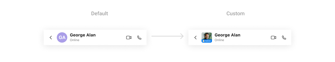
CustomLeadingView as a custom UIView:
titleView
Customize the title view of the header.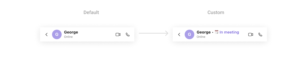
CustomTitleView as a custom UIView:
subtitleView
Customize the subtitle area (status, typing indicator).trailView
Customize the right side of the header (call buttons, etc.).
CustomTrailView as a custom UIView:
Styling
Style Hierarchy
- Global styles (
CometChatMessageHeader.style) apply to all instances - Instance styles override global for specific instances
Global Level Styling
Instance Level Styling
Key Style Properties
| Property | Type | Default | Description |
|---|---|---|---|
backgroundColor | UIColor | CometChatTheme.backgroundColor01 | Background color |
borderWidth | CGFloat | 0 | Border width |
borderColor | UIColor | .clear | Border color |
cornerRadius | CometChatCornerStyle? | nil | Corner radius |
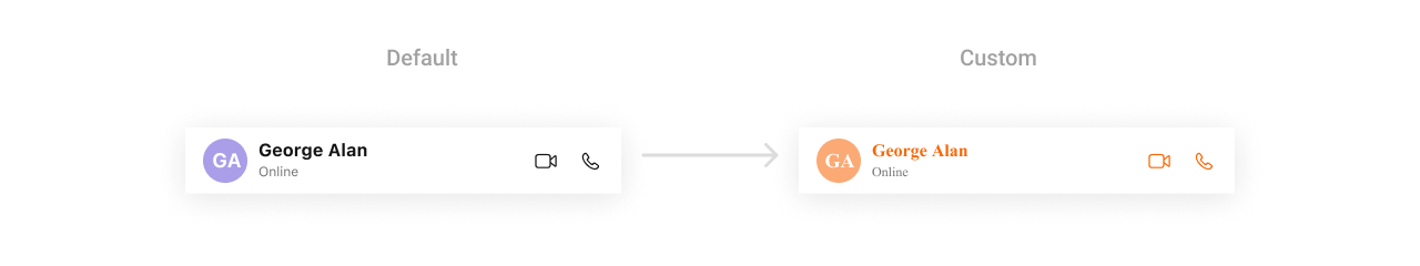
titleTextColor | UIColor | CometChatTheme.textColorPrimary | Title text color |
titleTextFont | UIFont | CometChatTypography.Heading4.medium | Title font |
subtitleTextColor | UIColor | CometChatTheme.textColorSecondary | Subtitle text color |
subtitleTextFont | UIFont | CometChatTypography.Body.regular | Subtitle font |
backButtonImageTintColor | UIColor | CometChatTheme.iconColorPrimary | Back button tint |
backButtonIcon | UIImage? | System chevron | Back button icon |
privateGroupBadgeImageTintColor | UIColor | CometChatTheme.iconColorSecondary | Private group badge tint |
passwordProtectedGroupBadgeImageTintColor | UIColor | CometChatTheme.iconColorSecondary | Password group badge tint |
avatarStyle | AvatarStyle | Default avatar style | Avatar customization |
Customization Matrix
| What to change | Where | Property/API | Example |
|---|---|---|---|
| Background color | Style | backgroundColor | UIColor.systemBackground |
| Title appearance | Style | titleTextColor, titleTextFont | Custom colors and fonts |
| Subtitle appearance | Style | subtitleTextColor, subtitleTextFont | Custom colors and fonts |
| Back button | Style | backButtonIcon, backButtonImageTintColor | Custom icon and color |
| Avatar look | Style | avatarStyle | AvatarStyle() with custom radius |
| Hide back button | Property | hideBackButton | header.hideBackButton = true |
| Hide status | Property | hideUserStatus | header.hideUserStatus = true |
| Custom subtitle | View Slot | set(subtitleView:) | See Custom View Slots |
Props
All props are optional. Sorted alphabetically.hideBackButton
Hides the back button in the header.| Type | Bool |
| Default | false |
hideUserStatus
Hides the user status (online/offline/last active).| Type | Bool |
| Default | false |
hideVideoCallButton
Hides the video call button.| Type | Bool |
| Default | false |
hideVoiceCallButton
Hides the voice call button.| Type | Bool |
| Default | false |
Events
The MessageHeader component does not emit any global UI events.Date Time Formatter
Customize how timestamps appear in the message header (e.g., “Last seen at…”) using theCometChatDateTimeFormatter.
Global Level Formatting
Instance Level Formatting
Available Formatters
| Formatter | Purpose | Default Format |
|---|---|---|
time | Standard time display | h:mm a |
today | Last seen today | Today at h:mm a |
yesterday | Last seen yesterday | Yesterday at h:mm a |
lastweek | Last seen within last week | Day name |
otherDay | Last seen older dates | MMM d, yyyy |
Troubleshooting
| Issue | Solution |
|---|---|
| Header not showing user info | Ensure user or group is set on the header |
| Status not updating | Check SDK connection and user presence listeners |
| Back button not working | Verify onBack callback is set and hideBackButton is false |
| Typing indicator not showing | Ensure typing events are enabled in SDK |
| Call buttons not appearing | Check that hideVideoCallButton and hideVoiceCallButton are false |
Related Components
- Messages - Parent component containing MessageHeader
- Message List - Display messages in a conversation
- Message Composer - Send messages in a conversation
- Conversations - Navigate back to conversation list